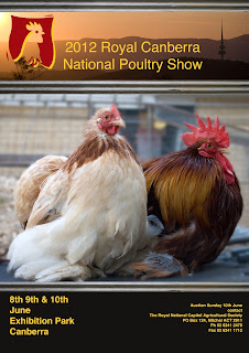
Here I created a poster to promote the National Poultry Show.
I divided the poster into 3 sections.
- The top section for the banner. This encompassed their logo and scenic views of Canberra.
- The middle or content section contains a picture of some show Pekins.
- The bottom or footer section shows the information on time, dates, contacts and venue

This is excellent work Rhonda.
ReplyDelete